Lulaway is South Africa's leading youth employment project management company - not a staffing agency that fills individual roles, but an organization that manages large-scale placement projects of thousands of young people at a time. With over 80,000 youth placed in the workforce, projects valued at hundreds of millions of rand, and more than 1,000 private sector employer partners, they're a major player in the South African employment space.
Lulaway came to us with a website that simply wasn't working. 15-second load times, outdated design, unclear content, and a user journey that led nowhere. The result: zero inquiries from the website. We carried out a full UX strategy and website development from scratch, and brought in Gili Brenner for the English copywriting - the same copywriter we worked with on MDAnet, since this project also required language that speaks to both governments and large organizations simultaneously.
Two weeks after the new site went live, their VP of Marketing called and asked us to remove the WhatsApp button because they were getting too many leads. Over 140 inquiries from website forms alone - not counting the WhatsApp messages. From zero to the opposite problem entirely.
"The team did an amazing job turning our vague ideas into a professional, impressive website. They showed endless patience with our many changes and requests, and delivered exceptional service that exceeded all expectations. They were always available, professional, and supportive throughout the entire process. I highly recommend their services."
.avif)

The central challenge with Lulaway is that the website needs to speak to three very different audiences, and convince all of them that this is a company they can trust with projects worth hundreds of millions of rand:
The South African government - the body that approves and funds the projects. They need to see a serious, transparent organization with proven results and government-grade management capability.
International governments and organizations - foreign entities that fund youth development in South Africa through Lulaway's programs. They need to see measurable social impact alongside business-level professionalism.
Large private sector companies - employers looking for quality workers at scale. They need a "wow" experience that signals innovation and technological capability, with a clear user journey that guides them toward action.
Each audience is looking for something different, but all of them need to trust Lulaway. That was the starting point that guided the entire UX strategy process.
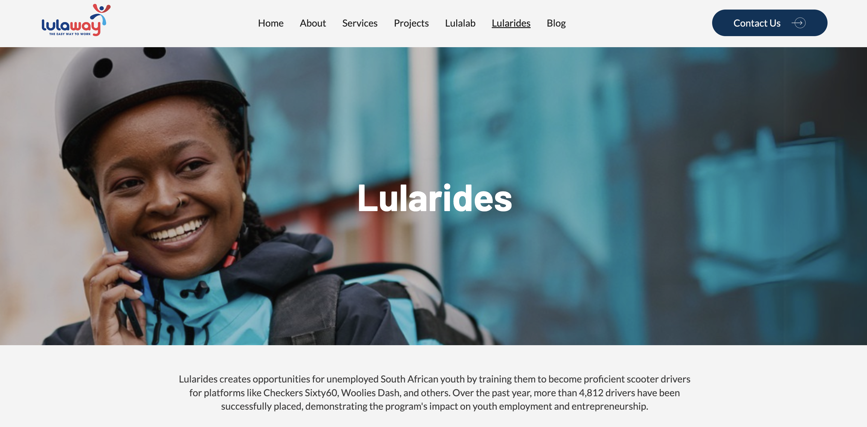
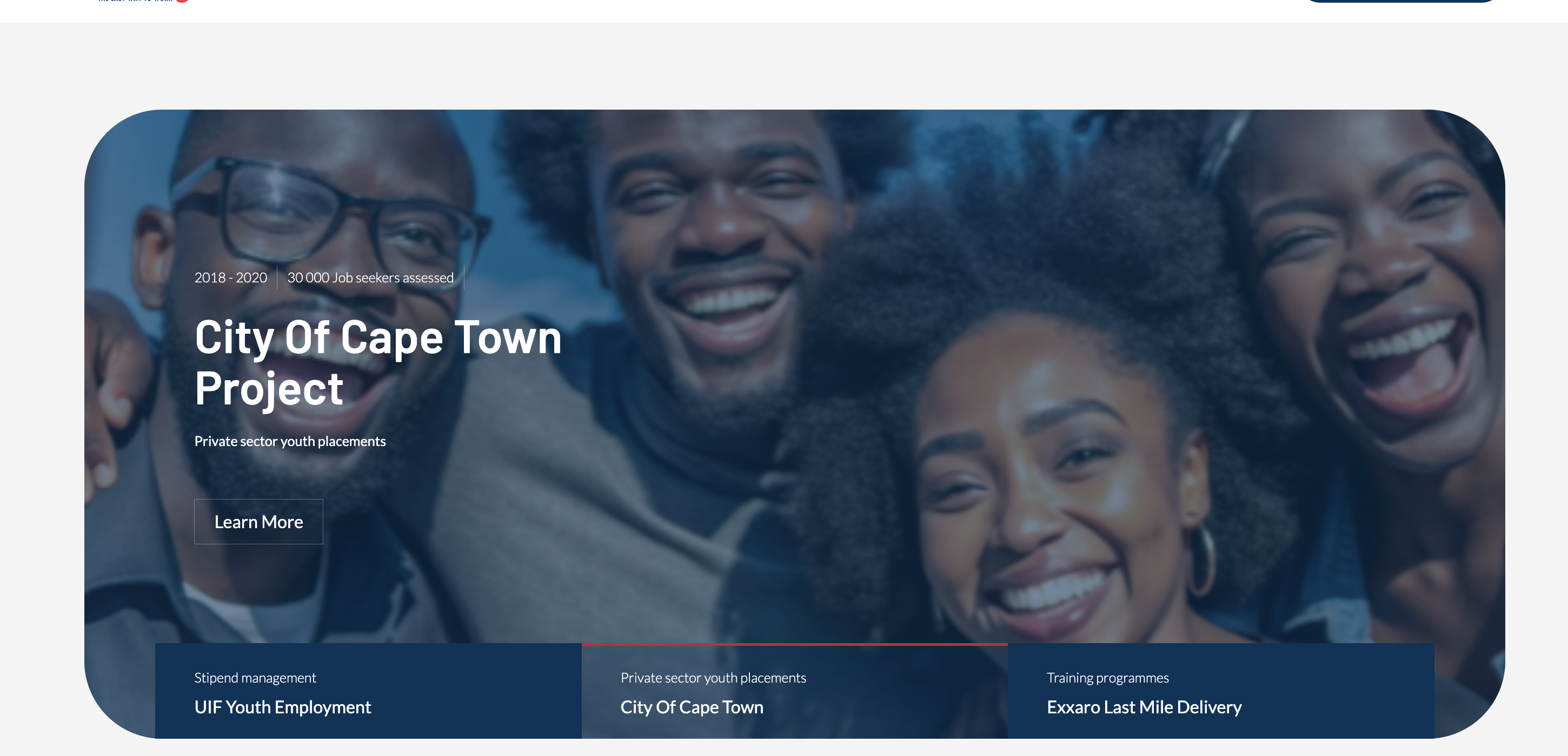
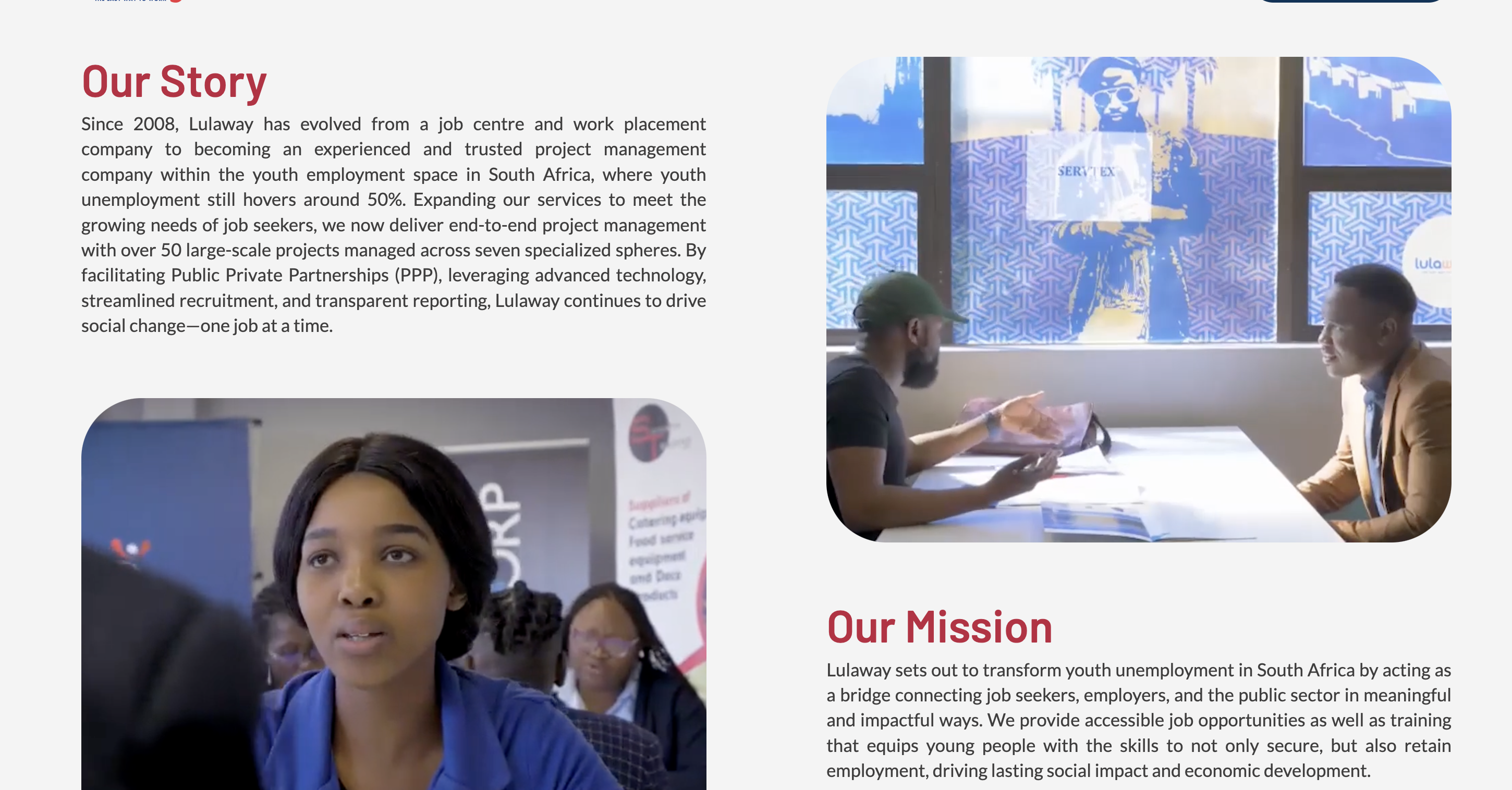
Our approach was to build credibility through proof, not words. The homepage opens with an authentic corporate video showing real operations on the ground - not artificial graphics, but real people in real projects. Immediately after - impressive numbers presenting the scale: total placements, project value, number of partners.
Throughout the entire site, we layered social proof at every stage of the scroll - testimonials, a detailed project list with results, and partner logos. The idea is that a visitor never has to take Lulaway's word for anything - everything is backed by evidence that speaks for itself.
For the user journey, we built the site so that at every point in the scroll, the visitor knows what comes next. Calls to action are adapted to the audience and strategically placed - never too pushy, but always present at the moment the visitor is ready to reach out.
We also built a massive blog as part of the organic search strategy. The result: Lulaway reached the first page of Google for their relevant search terms - rankings they never had before.

The before-and-after gap for Lulaway is one of our most striking: from a website that took 15 seconds to load and generated zero inquiries, to a site that brought in over 140 leads from forms alone in the first two weeks - until the company asked us to remove the WhatsApp button because they couldn't keep up with the volume.
Beyond the leads, the website changed the way the market perceives Lulaway. Their digital presence now matches the professional level of what they actually do. And from this project, another one was born - the branding of SNAPD, the new delivery company the group launched.


.svg)