Bi-Pol Electro-Optics is a technical partner to technology companies, research labs and OEM developers in Israel, working across electro-optics and microfluidics. Based in Kfar Saba, the company represents more than 20 manufacturers from around the world in Israel and supports its customers from concept to production: helping them choose the right component, coordinating with the manufacturer and staying involved long after the deal is done.
We worked directly with Evyatar, the company's CEO, on a full three-stage project, in this order: UX strategy, branding and website development in Webflow. Each stage was signed off with Evyatar before we moved to the next, so every design decision rested on what had already been defined.
"DuoDiv built our website on Webflow, and the result exceeded all our expectations. The team was very attentive to our requirements throughout the process and worked faster than expected, without compromising on quality. Beyond the website, they also designed our new brand, and we're very happy with the result. What truly sets DuoDiv apart is that they keep bringing technological innovation and let us manage and update the site ourselves, easily and intuitively, without depending on them for every small change."

The strategy phase defined three audiences. The primary audience is the optics world: optical engineers at technology companies, procurement managers at defense and medical companies, and academic researchers. The secondary audience comes from microfluidics: young entrepreneurs coming out of academia, biotech startups and advanced research labs. The third audience is international manufacturers looking for representation in Israel.
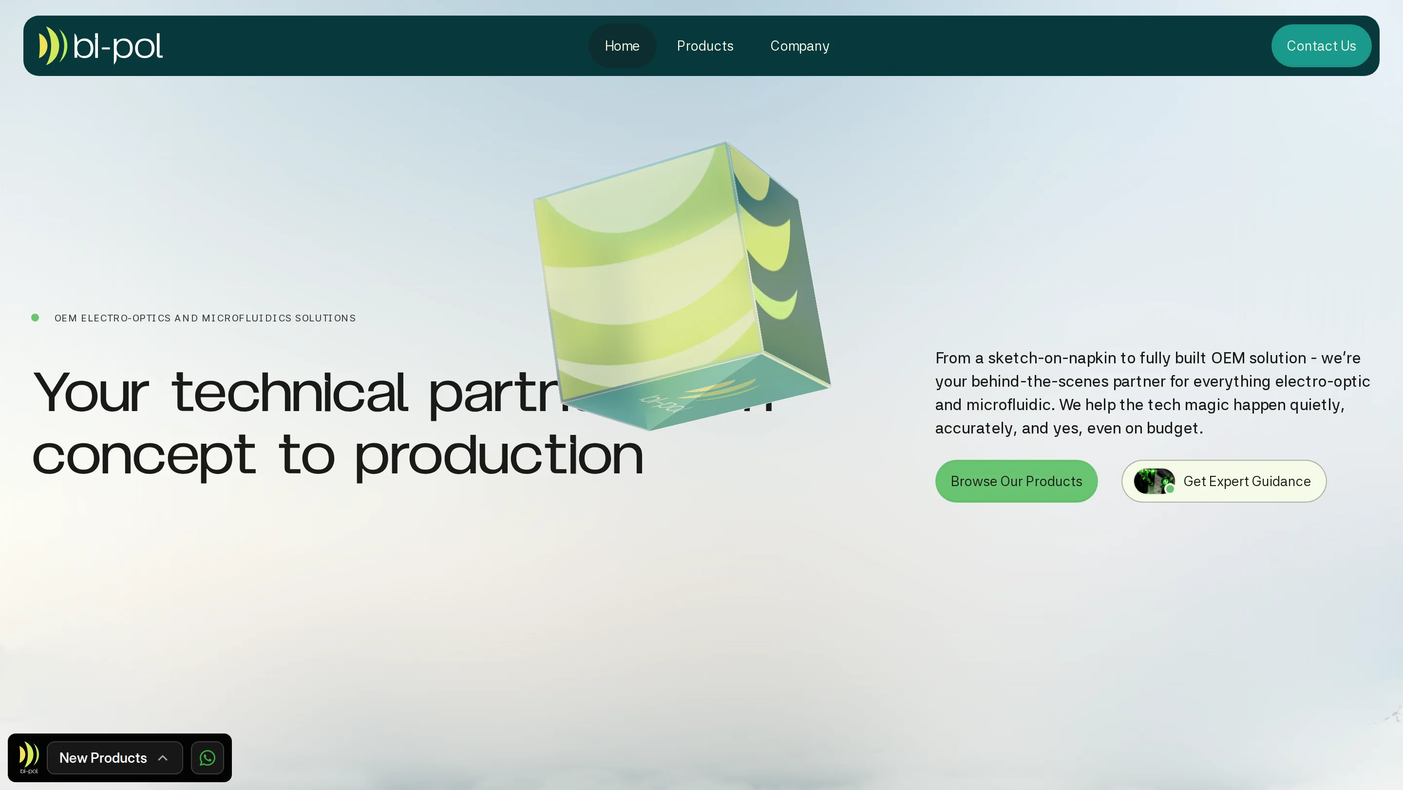
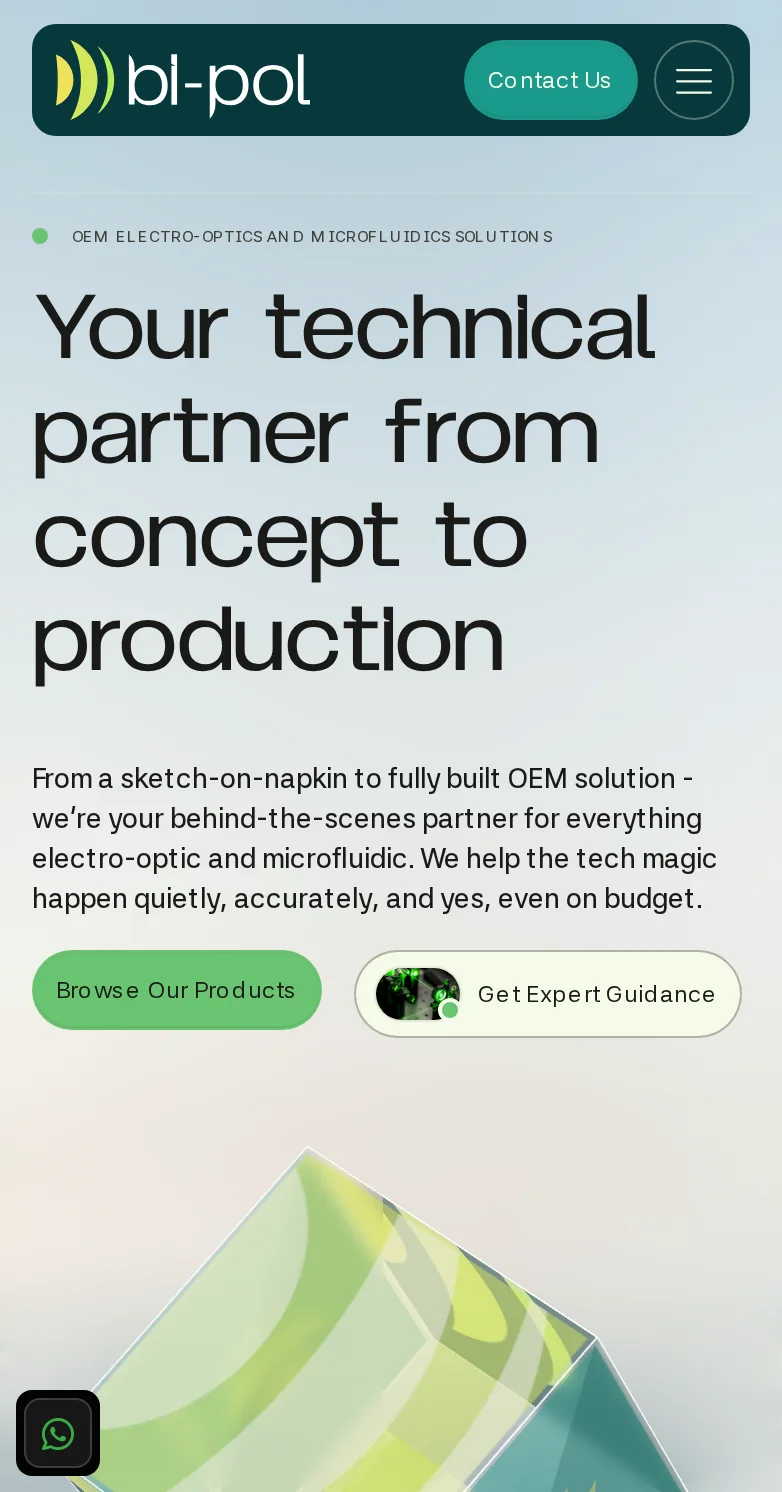
One of the first decisions was what would take center stage in the hero. Catalog sites tend to put a search bar there, but Bi-Pol doesn't sell off the shelf. Most of its customers are looking for a solution and don't yet know exactly which component they need. A prominent search bar would have presented the company as just another parts store, and left behind anyone who doesn't know the exact term. So the primary action in the hero is Get Expert Guidance, a conversation with an expert, with Browse Our Products next to it for those who already know what they're after.
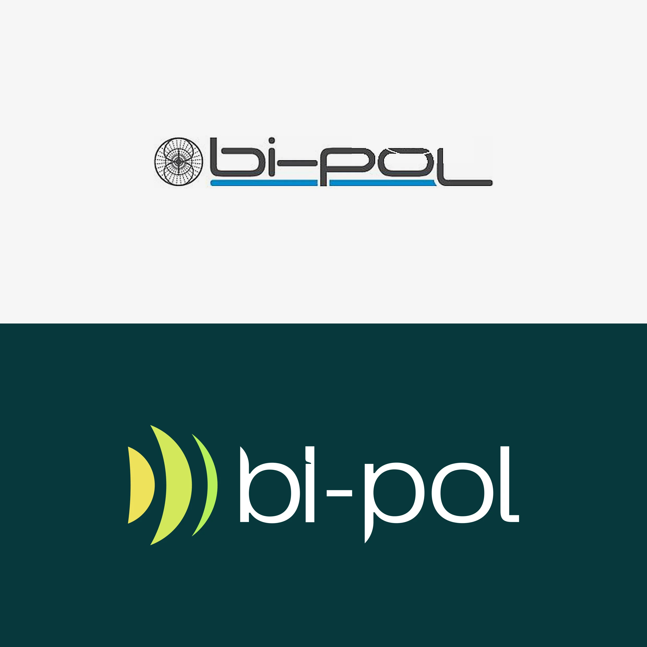
Bi-Pol's previous logo was a dipole symbol. When we asked why, the answer was that "dipole" sounds like Bi-Pol. The symbol itself had nothing to do with the company's service, and it was crowded with detail and hard to read at small sizes.
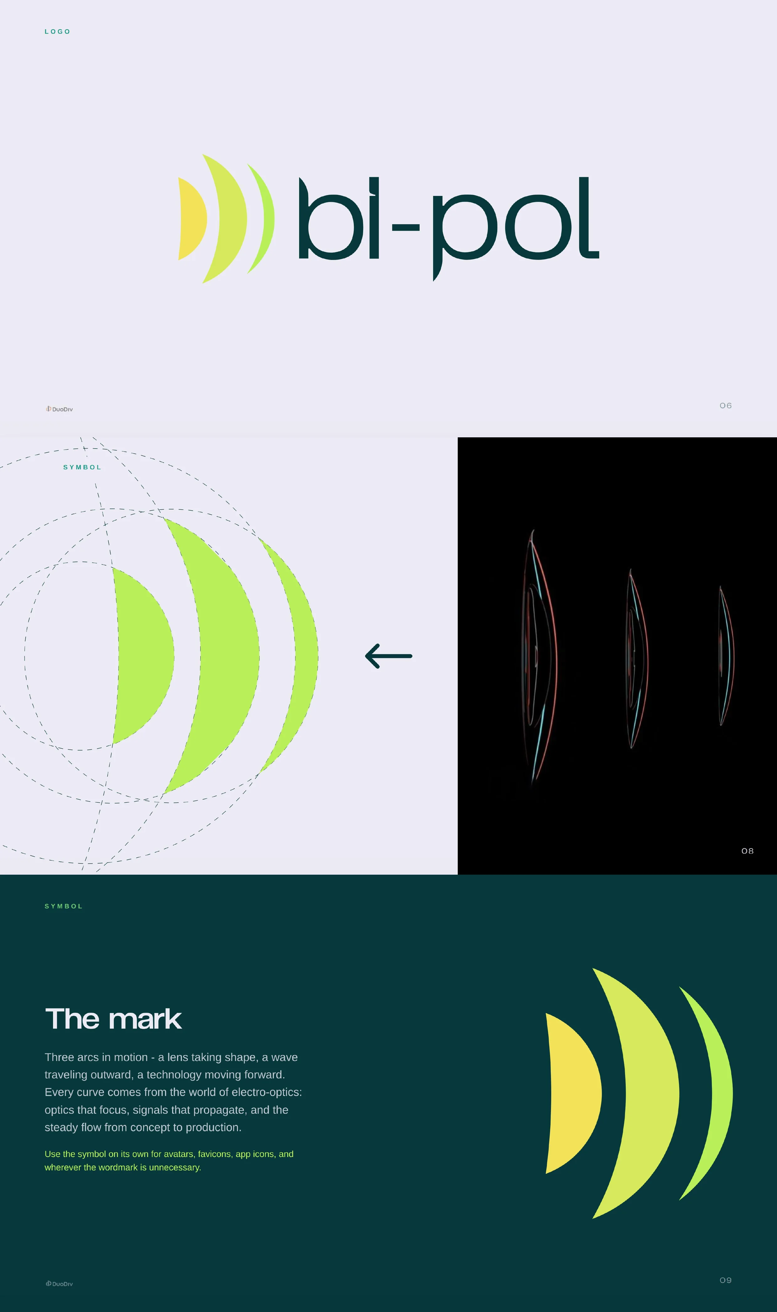
We presented Evyatar with two very different sketches. He took our recommendation and chose the bolder, more distinctive direction. The new symbol is built from three arcs: a lens taking shape, a wave traveling outward, and technology moving forward. Each arc is derived from circles on a single geometric grid, and the wordmark is drawn on the same grid. For the first time, Bi-Pol's logo carries a meaning an optical engineer recognizes instantly.
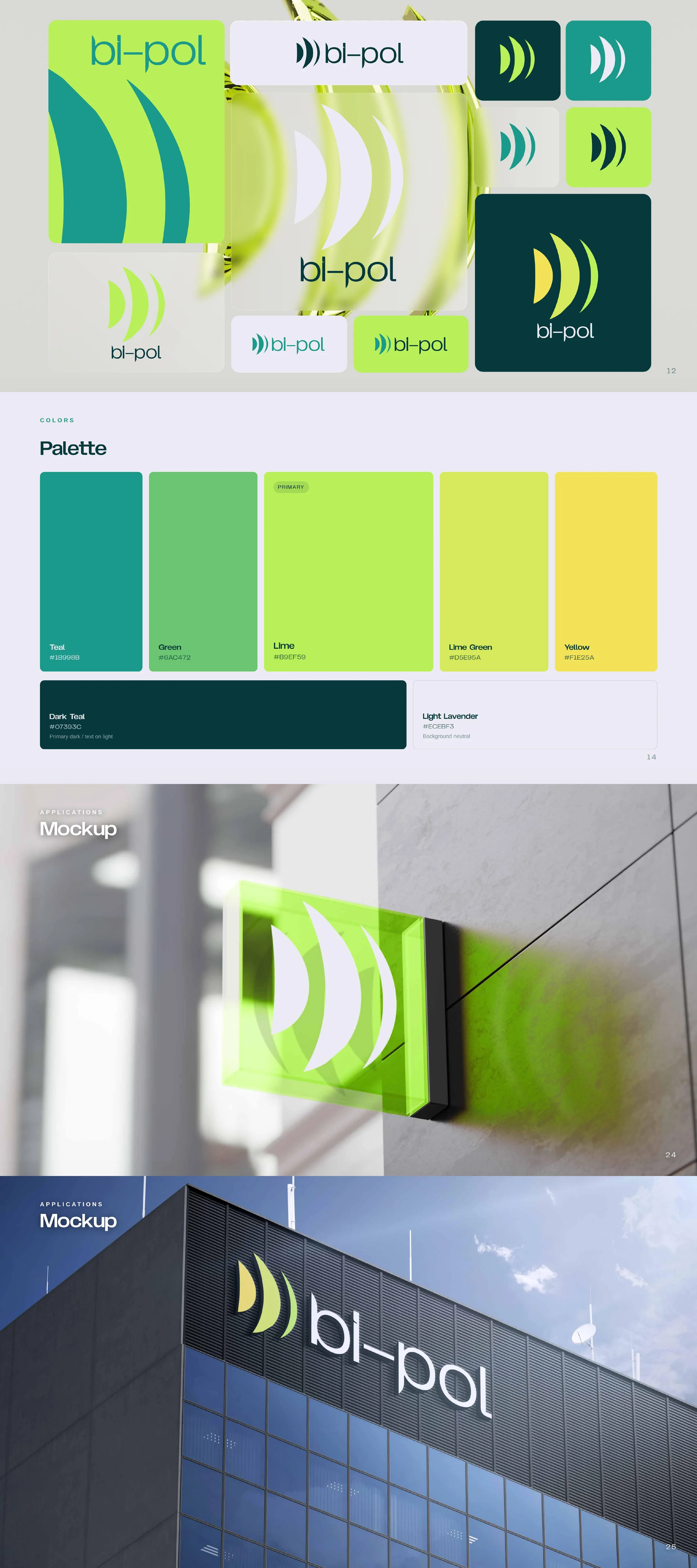
Around the symbol we built a complete brand book: a charged green spectrum anchored by deep teal, Bomstad Display for headings and 42dot Sans for text, and usage rules for every touchpoint, from business cards and email signatures to signage, video-call backgrounds and the LinkedIn page. The logo is minimal and precise, every element of the language is consistent with the rest, and Bi-Pol's presence stepped up all at once. Today its brand stands alongside the international manufacturers it represents.
Once the brand's design direction was set, we chose a Webflow template as the foundation for the site. We build on templates and fully adapt them to the brand, which makes choosing the template a strategic decision rather than a technical one. Bi-Pol took time to decide, and after internal discussions they went with our recommendation once again.
The hero had a clear brief: catch the eye rather than lead with functionality. But Bi-Pol didn't want a background video, because that's what everyone does. Rephael, our co-founder and art director, found the answer right near the end, after a long search: a 3D glass cube rotating at the center of the screen, carrying Bi-Pol's brand language on its faces. Optical engineers instantly recognize a familiar component from their own work: a cube beamsplitter, the transparent cube with the diagonal line.
The cube responds to the visitor. It follows the mouse, turns to clear glass while the mouse moves, and returns to the brand colors face by face once it stops. On scroll it opens up, the faces scatter, the navigation shrinks, and the site moves on to the product categories. Visitors stop to play with the cube before they've read a single word.
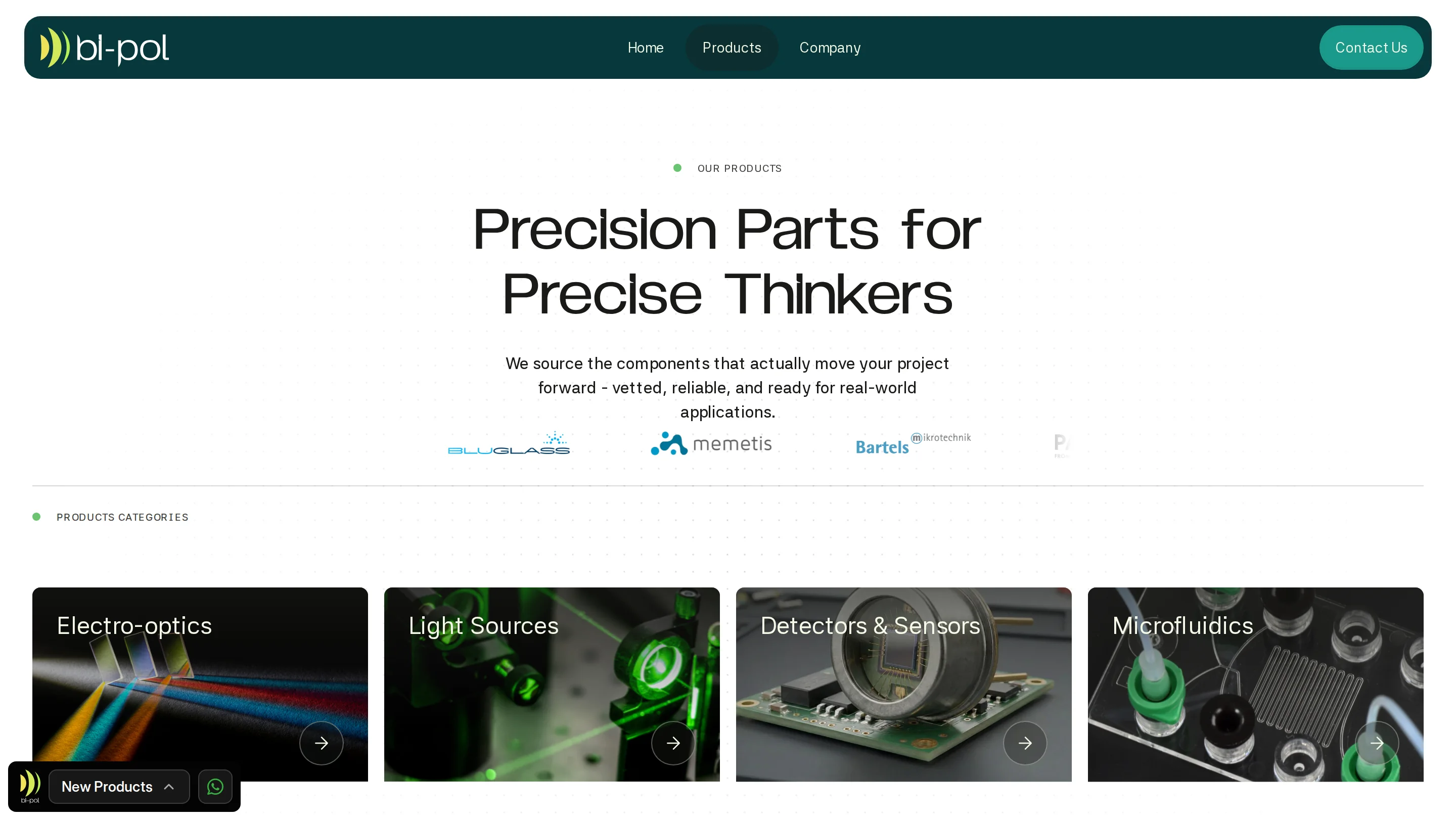
Behind the hero sits a complex structure: four categories (electro-optics, light sources, detectors and sensors, and microfluidics), more than 120 product pages, pages for more than 20 manufacturers the company represents, customer stories, a knowledge center and a blog. Every category page can be filtered by product name and by manufacturer, and the path to an expert stays open throughout the site.
We wrote the copy with Guy, our technical copywriter, who knows how to combine professional precision with a dash of marketing spice. Here too, Bi-Pol asked not to sound like everyone else, and the tone followed: Precision Parts for Precise Thinkers on the products page, The First Call Tech People Make on the About page, and a hero promise that ends with "and yes, even on budget."
After launch, we connected Claude to Bi-Pol's Webflow site. The team now updates content and adds products to the catalog quickly, without filling in every field by hand.
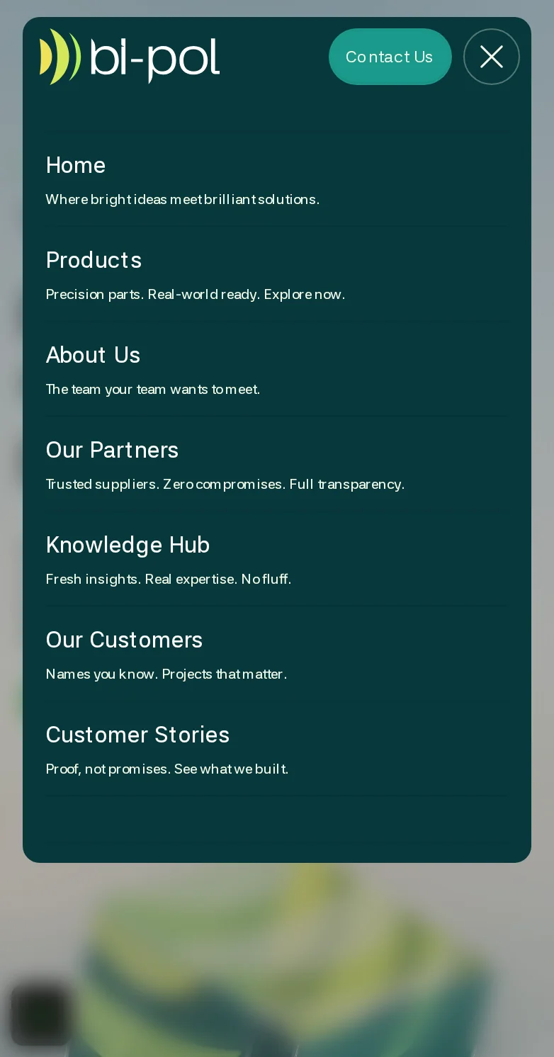
Bi-Pol's website is live at bi-pol.com. The branding, the website and the copy were built as one system: the arcs from the logo return on the faces of the cube, the colors carry through every page, and the tone of the copy is the same at every touchpoint. An engineer who lands on the site understands within seconds that this company knows the optics world from the inside.
Bi-Pol joins our projects where we delivered both a full brand and a website, alongside NBT, where we also built a product catalog and connected Claude for content management. In both projects, the branding set the language and the website turned it into an experience.
This project shows why we work Blueprint First: the strategy defined what the visitor needs to do, the branding defined how the company looks, and the hero brought the two together.


.svg)


.webp)


