Medocann is a family-owned Israeli medical cannabis company, growing in a smart, fully controlled indoor facility on land the family has farmed since 1927. It runs two brands: SEVEN, the medical brand launched in 2021 for patients, pharmacists and physicians, and SOLO, a boutique line of rare genetics for premium consumers. Today Medocann is entering the UK and German markets while continuing to serve Israel.
We worked with Asaf, Medocann's CEO. The goal he set was ambitious: one website that serves European business partners, pharmacists and doctors, patients and connoisseurs, without any of them feeling it was built for someone else. The project began with a month-long UX strategy phase, followed by design and website development in Webflow.

Most websites we plan speak to one or two audiences. Medocann has four, with needs that sometimes pull in opposite directions, which is why the strategy phase took a full month.
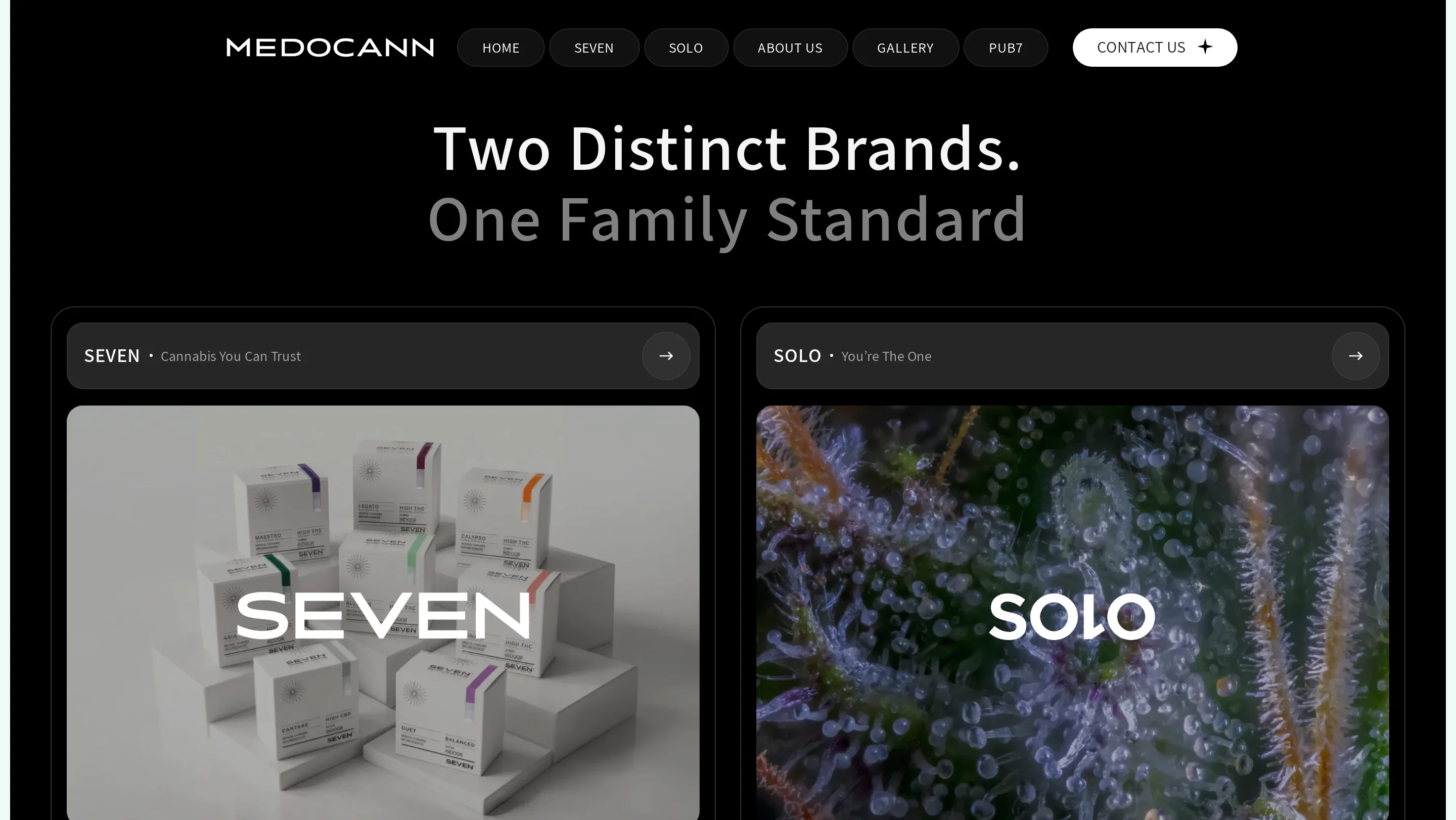
That led to the central decision: every audience gets its own front door. Business partners enter through the Medocann homepage. Doctors and pharmacists land on SEVEN and the research on Pub7. Patients and consumers go straight to the brand that fits them. All of it lives in one Webflow site, with a single CMS and English as the primary language, instead of three separate sites to maintain.
Every cannabis company in Israel says "high quality", "indoor grown" and "pesticide free". To understand what really sets Medocann apart, we visited the cultivation facility with Asaf. Before entering the controlled area we put on hair covers, masks, coveralls, gloves and shoe covers, and behind the door was a whole world of advanced technology.
The visit set the tone for the entire site: show the process, the data and the facility instead of making claims. That is where sections like The Architecture of Consistency on the homepage and Where Hi-Tech Meets Pharma on the About page come from, explaining how consistency is kept from batch to batch. The design language steps away from the industry's clichés too, choosing sophistication and modernity instead.
Each area of the site is built for its own audience, with its own pace, colours and interactions. Navigation, typography and component structure are shared, so moving from Medocann to SEVEN or SOLO feels like staying in the same family.
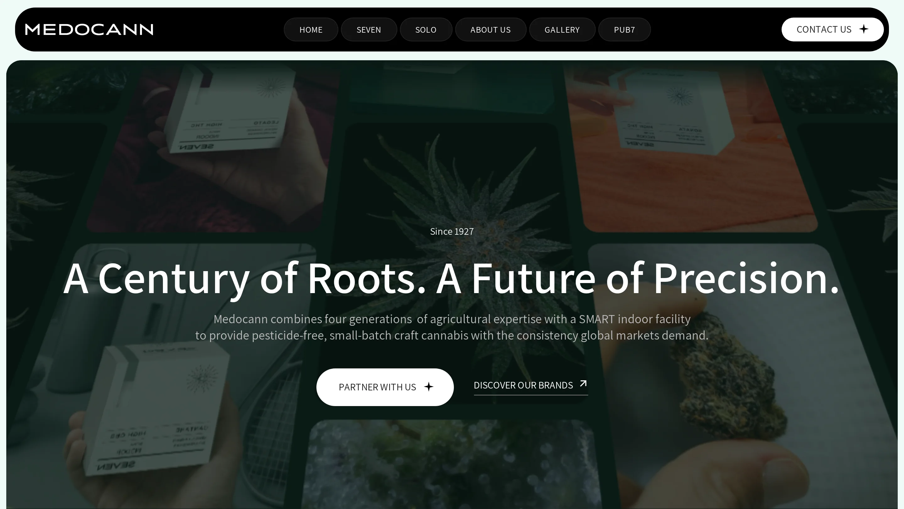
The homepage opens with A Century of Roots. A Future of Precision. As you scroll, the hero shrinks into a card, and rotating cubes flip from image to information: more than 100 years of farming, pesticide-free cultivation and small batches. The Two Distinct Brands. One Family Standard section presents both brands side by side and sends each visitor into their own world, and the page closes with a call to partners: A Partner Built for Consistency.
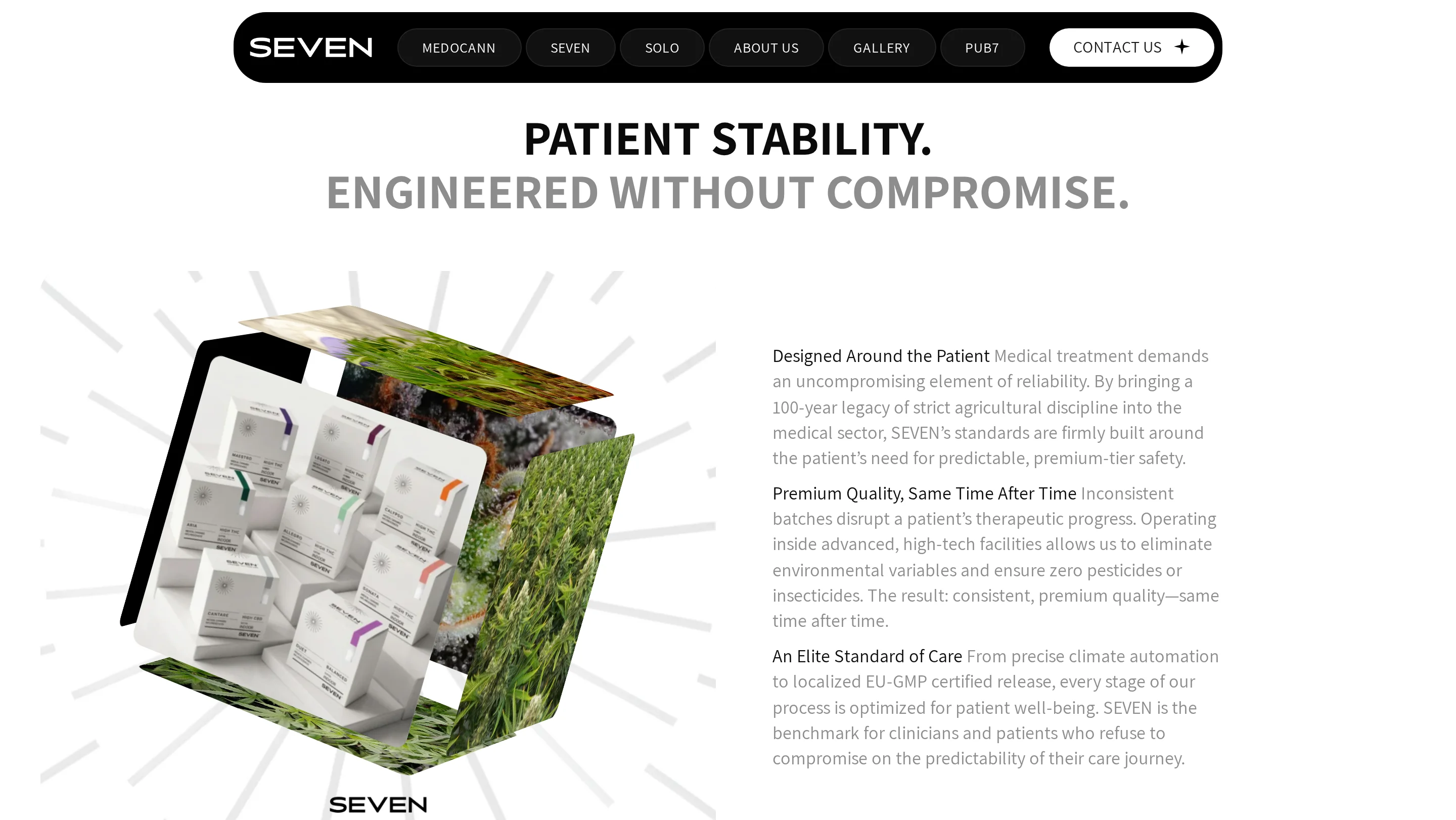
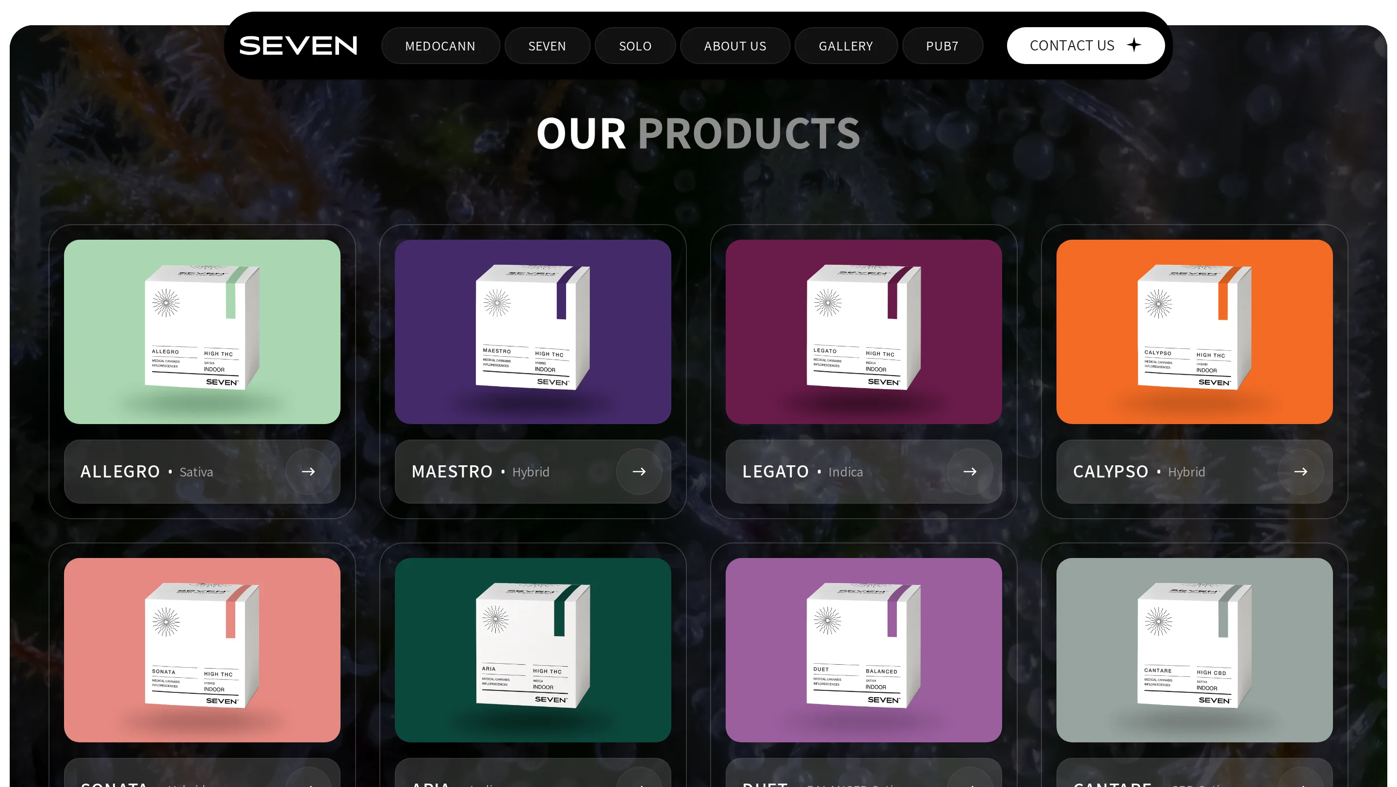
A clean, white page that feels like a pharmaceutical company. It opens with a 3D carousel of the product packaging, followed by the brand's seven pillars of trust and a catalog of 8 products listing THC, CBD and strain type. Midway down, a cube that rotates as you scroll accompanies the headline Patient Stability. Engineered Without Compromise, and toward the end, research from Pub7 is presented for doctors and pharmacists.
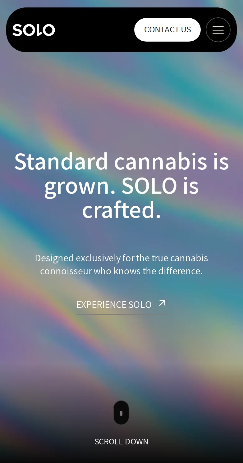
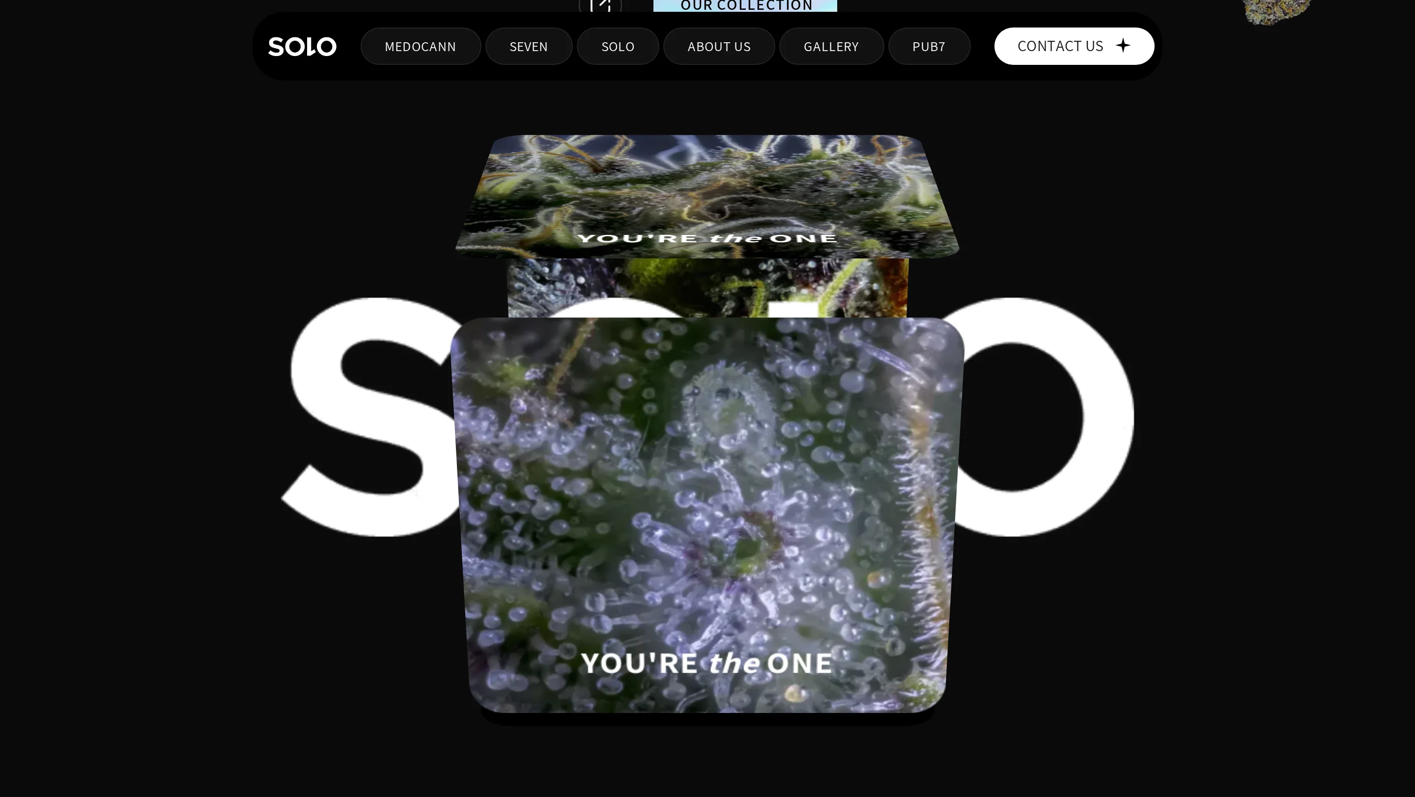
A black, holographic world that feels closer to a fine whisky brand than a catalog. It opens with Standard cannabis is grown. SOLO is crafted., and further down a cube rotates around the word SOLO. The strains appear as a stack of cards with the jar, genetics, lineage and terpenes, and each of the 10 strains has its own page that opens on a black screen with its name. At the end of the page, images scatter around the call Stay connected. You're the one.

Medocann's website is live at medocann.com. A distributor in Germany, a pharmacist in Tel Aviv and a consumer looking for the next strain all visit the same site, and each comes in through the door built for them. When a new product joins one of the brands, Medocann's team adds it in a single CMS.
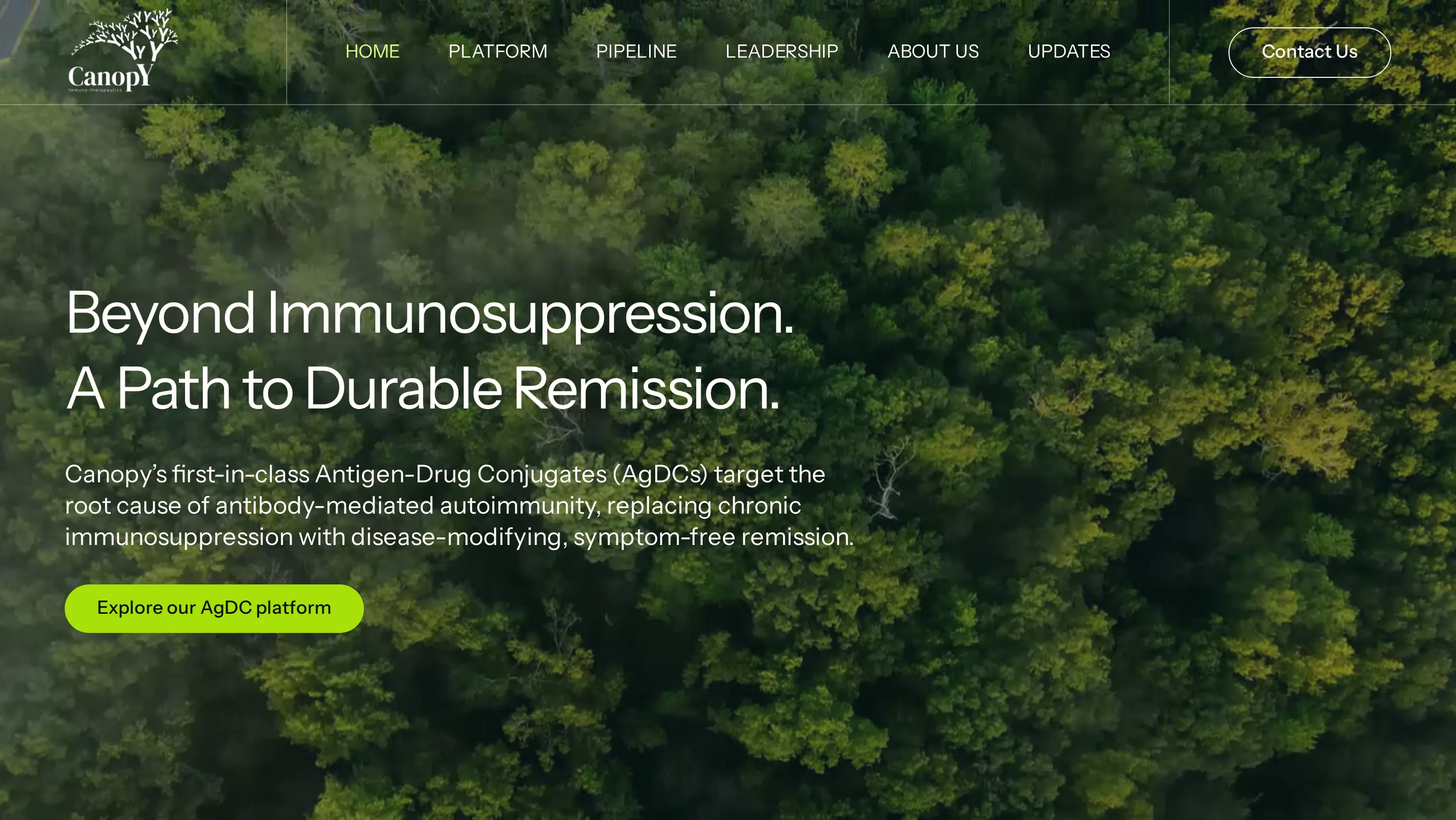
Medocann joins our work in health and science, alongside Canopy, a biotech company whose website was also built around a very specific professional audience.
This project shows why we work Blueprint First: when one website has to speak to four audiences in three markets, a month of UX strategy is what lets each of them feel at home.


.svg)